One of the great things about pay per click advertising is the flexibility it offers – you can keep on assessing and making alterations to your budget, key words and advert text and layout until you get the results you want.
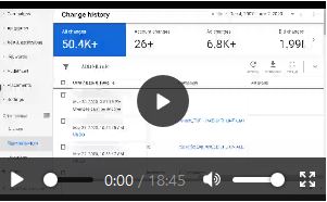
 You can also measure results in a lot more detail than in most forms of advertising, which means you really can tailor your advertising and also your website, making informed adjustments to continuously optimise your returns.
Table of Contents
What can you measure?
- Which adverts get most clicks
- Which keywords are most popular
- What percentage of clicks convert to purchases
- How long customers spend on your website
- Which pages they visit
What next?
Obviously once you know which adverts and keywords are the most productive, you can focus your campaign around these. But what can you do if your click to purchase ratio still isn’t high enough?
First impressions
The first thing to get right is your landing page. What do customers see when they arrive at your site? Continuity is vital here. Remember, they’ve entered those particular keywords and clicked on that particular advert for a reason. If what they see doesn’t immediately match up with these two things, they’re unlikely to stick around.
Ease of access
Next, which pages do customers click through to? And, perhaps most importantly, where do they exit from? Again, are these pages clearly linked to your customer’s search terms, and how easy is your site to navigate? In other words, how many clicks would it take your customer to get from landing page to payment? Do some trial runs. Test out your key words and then see how many pages you have to click through to get to the relevant checkout page.
Clarity
The importance of clarity simply cannot be underestimated. A customer should be able to view your site and immediately know what to do next – even a few seconds hesitation and you’ll probably lose them. How do you want your customer to select a product? From a selection of categories? By entering a search term? Using a drop-down menu? Whatever the process, make it clear, make it stand out, and position it where the customer expects it to be – ie. across the top of the page, down the left-hand side, or bang in the middle.
The clarity principle also applies to individual products. Customers should be able to get an immediate overview, with clearly marked options to access further details (both written and visual). The more detail you include the better – you don’t want a customer to leave just because they’ve got an unanswered question.
Unique selling point
Why should a customer buy from you, rather than anyone else? Depending on how far down the line towards purchasing a customer is, they may be leaving your site simply because they feel they haven’t looked around the marketplace enough yet. So ironically, being the first site they land on could actually decrease your chances of being the site they buy from. We’ve all done this when making a buying decision – that feeling of ‘Well, it’s what I want but I feel I should do a bit more research before I go ahead.’
How can you prevent this from happening? Basically you need to somehow convince your customer that not only do you have what they want, but that they won’t find better anywhere else. You can achieve this is various ways, depending on what your customer base prioritises. It could mean including details about the superior quality of your products, ethical or environmental credentials, unique design details or services or special offers.
You probably don’t want to get into a head-on confrontation with a competitor, but you could include some kind of price comparison. Previous customer ratings and reviews for individual products can also be very persuasive factors in getting your client to make the final click, as can little touches such as free shipping or a clearly flagged policy promising to refund any unsatisfactory products.

Need Google Ads Management Help?
Free Google Ads account review for
qualified clients
Almost 20 years experience
Finally, consider the overall design of your site. What subliminal messages is it sending out? How does it compare to competitor sites? This is where a professional designer comes in handy – they could give you a visual edge that means your customer will be halfway to purchasing before they even read a word.