Google Ads can be very profitable for some but not all businesses. You won’t know until you try! And hiring a management agency to set up your Google ads account can increase your odds of success.
Google Ads can be very profitable for some but not all businesses. You won’t know until you try! And hiring a management agency to set up your Google ads account can increase your odds of success.
Expensive is a relative term. The real question is if there is a positive ROI caps for your business. Hiring a management agency increases your odds of success.
Google Ads are effective for some clients but not for others. Hiring a management agency increases your odds of success.
There are a myriad of reasons for why Google ads could be disapproved. In your account you can search for “disapproved ads” at the search box at the top. Or hire a management agency to help you.
Try searching on YouTube to find tutorials or hire a Google ads management agency to handle everything for you.
You can use the Google ads add preview tool google.com/AdPreview to find your ads or usearchfrom.com or consider hiring a professional to manage your account who can do these searches for you.
You should use Google ads when you think the potential customers could be looking for your business via simple keyword searches like “hire a dog walker” or “purchase real estate in New York”. Consider hiring a Google ads management agency to help set this up for you.
Webrageous can audit your Google Ads account at no charge as long as you are spending at least $2,000 per month.
Google ads allows you to show up at the top of search engine results immediately, schedule your ads to run anytime, control your daily budget, and calculate the success of your campaigns. Additional advantages of PPC on Google Ads are:
- huge customer base from all over the world
- huge number of Google searches
- benefits outweigh the costs
- and many more benefits listed here
To prevent overbidding or over paying for Google PPC ads you’ll want to improve your quality score, and test both manual and automatic bidding.
Webrageous pays a 25% referral fee forever on white label Google Ads clients that you send our way. Contact us to start earning money today.
Click here for the latest on PPC management costs.
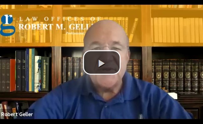
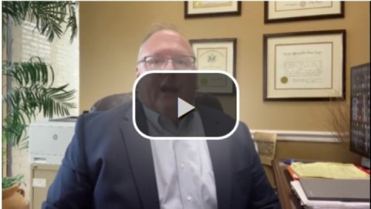
Please watch this intro video by our founder. And check out our PPC results page and PPC testimonials page.
The most successful bankruptcy bankruptcy attorney PPC keywords are:
- bankruptcy
- bankruptcy attorney
- bankruptcy lawyer
- file bankruptcy
- bankruptcy law
- bankruptcy chapter 7
In February 2021 a bankruptcy attorney client who has been with us for several years in a very competitive metropolitan area told us their cost per signed case from Google Ads is only $388.89 including our management fee.
Watch This Video To See The Amazing Cost Per Lead We See With
Google Ads For Bankruptcy Attorneys in 2021
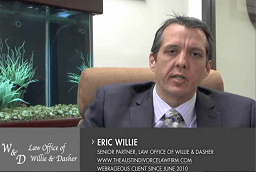
Webrageous Bankruptcy Attorney Testimonial
Webrageous Bankruptcy Attorney Testimonial
Webrageous Bankruptcy Attorney Testimonial
VideoThe most successful personal injury attorney PPC keywords are:
- accident attorney
- accident lawyer
- car accident attorneys
- car accident lawyer
- car crash attorney
- car crash lawyer
- injury attorney
- injury lawyer
- personal injury attorney
- personal injury attorneys
- personal injury lawyer
- personal injury lawyers
The most successful family law PPC keywords are:
- divorce attorney
- divorce lawyer
- family law attorney
- family law lawyer
- uncontested divorce
The most successful criminal PPC keywords are:
- assault lawyers
- attorney {city} criminal
- criminal lawyers
- domestic violence defense attorney
- domestic violence lawyers
- expunge your record
- expunged record
- how to expunge a record
- probation lawyers
- theft lawyers
The most successful drug rehab PPC keywords are:
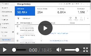
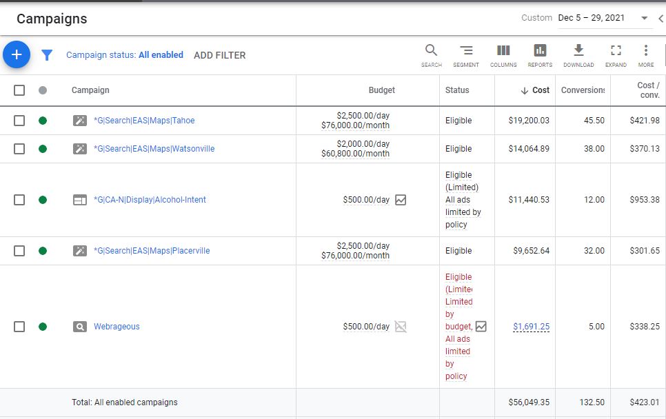
Take a look at how successful our launch was of a new drug and alcohol rehab campaign. You will see the campaign named Webrageous. During its first few days of launch it became one of the most successful campaigns in terms of a low cost per lead for our new drug and alcohol rehab client.
- alcohol abuse center
- alcohol abuse centers
- alcohol abuse clinic
- alcohol abuse clinics
- alcohol abuse program
- alcohol abuse programs
- alcohol abuse rehab
- alcohol abuse rehabilitation
- alcohol abuse service
- alcohol abuse services
- alcohol abuse treatment
- alcohol abuse treatments
- alcohol addiction center
- alcohol addiction centers
- alcohol addiction clinic
- alcohol addiction clinics
The most successful cosmetic surgery PPC keywords are:
- breast augmentation
- breast enhancement surgery
- breast lift cost
- breast reduction doctor
- lipo center
- lipo cost
- liposuction
- liposuction cost
- liposuction surgery
- tummy tuck cost